Academic Task 1
How to describe a pie chart in IELTS Task 1
A pie chart is the most common proportion question in Academic Task 1. The skill is not reading numbers — it is grouping similar slices and describing shares in clear, varied language. This guide shows you how, the way an examiner marks it.
In short
- A pie chart shows parts of a whole as percentages adding up to 100. Describe proportions, not raw counts.
- Lead your overview with the largest and smallest slices, then group segments that have similar shares.
- Vary proportion language: accounts for, makes up, a fifth, the majority, twice as large as.
Read the proportions before you write
A pie chart divides a single whole into segments, almost always labelled as percentages that total 100. The examiner is not testing arithmetic. They want to see that you can identify the main proportions and report them in a logical order, in at least 150 words.
Before writing, find three things: the largest slice, the smallest slice, and any segments with similar shares that you can group together. Grouping is what separates a band 7 answer from a band 6 one. A weaker writer lists every figure in turn; a stronger writer says "the three smallest categories — clothing, books and travel — each accounted for around a tenth of spending."
If you are given two pie charts (for example, two different years or two countries), the comparison itself is the key feature. Describe how the same category changed or differed between the charts rather than describing each chart separately.
A four-paragraph structure that works
Use the same reliable shape every time. It keeps your answer organised, which directly supports the Coherence and Cohesion criterion.
- Introduction. Paraphrase the question. "The chart illustrates the proportion of household income spent on six categories." Do not copy the prompt word for word.
- Overview. State the biggest and smallest proportions in one or two sentences. No specific numbers are required here — this is the headline.
- Body 1. Detail the largest slices with figures, grouping any that are close in size.
- Body 2. Detail the smaller slices, again grouping similar shares and adding a comparison.
Worked overview: "Overall, food made up the largest share of spending, while savings accounted for the smallest proportion. The remaining categories each represented between a tenth and a fifth of the total."
Proportion language that lifts your band
Repeating "is" and bare percentages caps your Lexical Resource. The table below shows how a band 6 phrasing becomes a band 7 one by varying verbs, fractions and comparisons.
| Figure | Band 6 (flat) | Band 7 (varied) |
|---|---|---|
| 52% | Food is 52%. | Food accounted for the majority, at just over half. |
| 20% | Rent is 20%. | Rent made up a fifth of total spending. |
| 10% and 11% | Books are 10% and travel is 11%. | Books and travel were broadly similar, at around a tenth each. |
| 30% vs 15% | Transport is 30%, leisure is 15%. | Transport represented twice as large a share as leisure. |
| 4% | Savings are 4%. | Savings comprised the smallest proportion, at a mere 4%. |
Notice the verbs change (accounted for, made up, represented, comprised) and the figures appear as fractions and approximations, not only exact percentages. That mix is exactly what the Grammatical Range and Accuracy and Lexical Resource criteria reward.
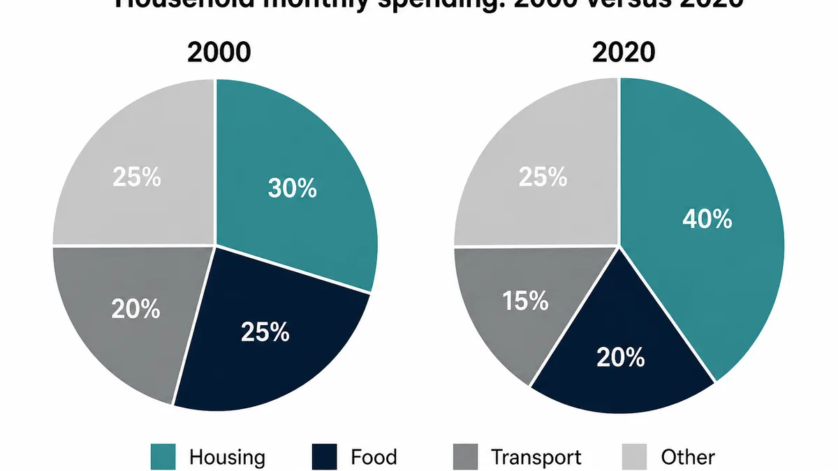
Worked example
IELTS Task 1 pie chart FAQ
What does an IELTS Task 1 pie chart show?+
A pie chart shows how a whole is divided into parts, usually as percentages adding up to 100. Your job is to describe the proportions: which slices are largest and smallest, which are similar, and how the shares compare.
How do I structure a pie chart answer?+
Use four short paragraphs: an introduction that paraphrases the question, an overview of the main proportions, and two body paragraphs grouping similar slices or comparing two charts. Aim for at least 150 words.
Do I describe every single slice?+
No. Report the key features. Highlight the largest and smallest segments, group slices with similar shares, and mention notable comparisons. Listing every figure without grouping lowers your Coherence and Cohesion score.
What proportion language should I use?+
Vary your phrasing: accounts for, makes up, represents, the majority, a fifth, just under a third, twice as large as. Mixing fractions, percentages and approximations shows Lexical Resource and Grammatical Range.
Can a human teacher correct my pie chart answer?+
Yes. Our qualified teachers mark your Task 1 against all four IELTS criteria and return annotated feedback within 48 hours, so you see exactly where proportion language, grouping or accuracy cost you marks.