Academic Task 1 question types
How to describe an IELTS Task 1 line graph
A line graph in IELTS Academic Task 1 shows how values change over time. Your job in at least 150 words is to report the overall direction, group the key trends, and describe the turning points accurately, without giving your opinion. This guide shows you the structure, tenses, and vocabulary that move a response from a band 6 list of numbers to a band 7 description that selects and compares.
In short
- A line graph shows change over time, so structure your answer around trends and turning points, not isolated numbers.
- The overview, one or two sentences naming the main trend, is the single most important sentence for your Task Achievement score.
- Use past tenses for past dates and future forms only for years the graph projects forward.
Structure: four paragraphs that group the data
A reliable line-graph answer has four parts. Open with an introduction that paraphrases the question: change the wording, not the meaning. For example, rewrite "The graph below shows electricity production in three countries from 2000 to 2020" as "The line graph illustrates how much electricity was generated in three nations between 2000 and 2020."
Follow with the overview. This is one or two sentences that name the main movement across the whole graph and carry no specific data. Signpost it clearly: "Overall, all three figures increased over the period, with the sharpest rise seen in the country that started lowest." The examiner looks for this sentence first under Task Achievement, so it must be present and accurate.
Then write two body paragraphs. Group the lines logically, by line (one paragraph per country, or pairs that behave similarly) or by time period (before and after a clear turning point). Inside each paragraph, support the trend with selected figures and dates: highest and lowest values, sharp changes, and any crossover where two lines meet. You do not need every data point, only the ones that prove the trend.
Trend vocabulary: verbs, adverbs, and turning points
Lexical Resource rewards range, so vary how you describe movement. Pair a movement verb with an adverb of degree to show precision: "Sales rose sharply," "Unemployment fell steadily," "The figure climbed gradually." For flat sections use "plateaued," "remained stable," or "levelled off." For up-and-down movement use "fluctuated" and name the band it moved within.
Mark turning points so the reader follows the shape of the line. Useful phrases include "reached a peak of," "hit a low of," "before recovering to," and "after which it began to decline." A noun-phrase alternative raises your range: instead of "the number rose sharply," write "there was a sharp rise in the number." Alternating verb and noun forms is a quick way to lift Grammatical Range & Accuracy.
Keep your tenses consistent. Describe past years with past simple ("production fell in 2010"). If the graph projects forward, switch to future forms for those years only: "the figure is expected to reach 80 units by 2030" or "is projected to rise steadily." Never mix a future projection into a past trend.
Band 6 to band 7: phrasing the same trend better
The data is identical in each row below. The difference is selection, grouping, and precision, the qualities examiners reward under Task Achievement and Lexical Resource.
| Feature on the graph | Band 6 phrasing | Band 7 phrasing |
|---|---|---|
| A steep increase | It went up a lot. | The figure rose sharply, climbing from 20 to 65. |
| A flat section | It stayed the same. | The figure plateaued at around 40 between 2012 and 2015. |
| A peak then a fall | It went up then came down. | It peaked at 90 before declining gradually to 70. |
| Two lines meeting | They were the same at one point. | The two figures converged at 50 in 2018. |
| Up-and-down movement | It changed up and down. | The figure fluctuated between 30 and 45 across the decade. |
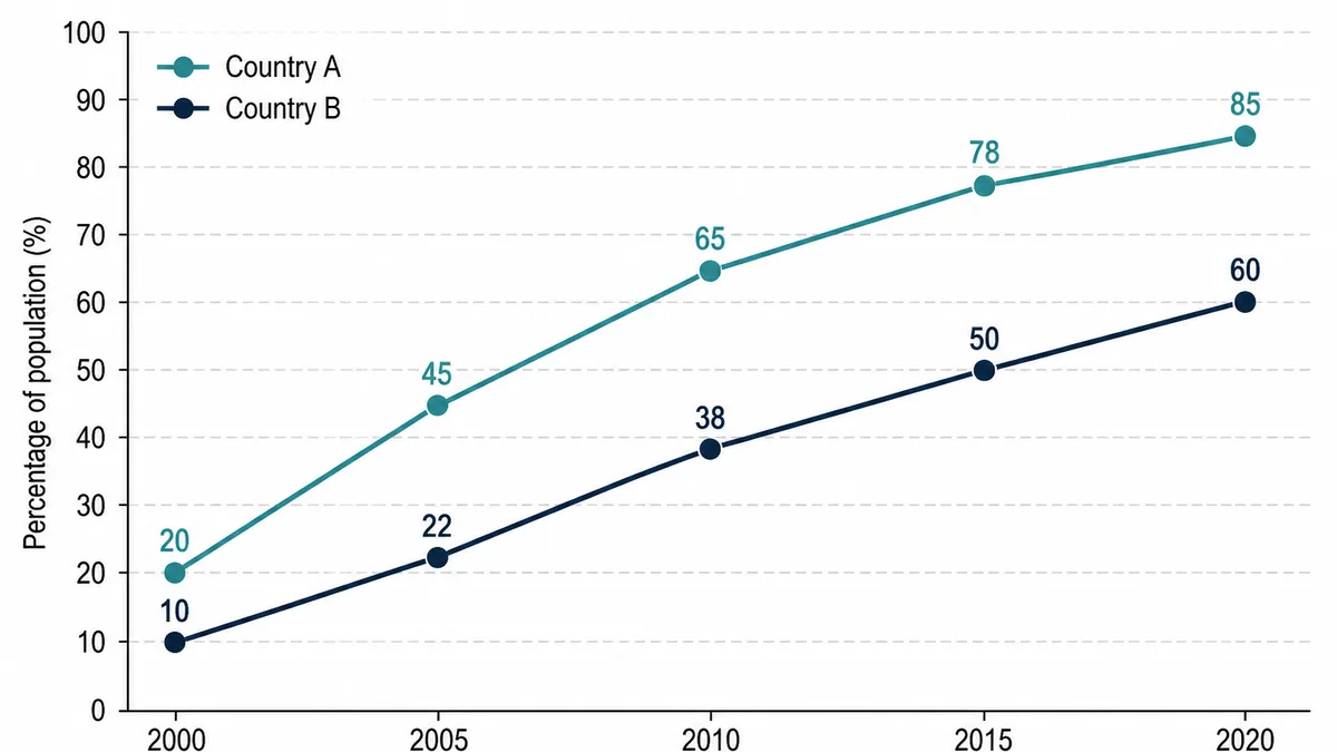
Worked example
Line graph questions, answered
How do I write an overview for a line graph?+
Your overview states the main trend or trends across the whole graph, with no specific numbers. For a line graph, name the overall direction (rising, falling, fluctuating) and which line ended highest or lowest. Begin it with a signpost such as Overall.
Which verb tense should I use for a line graph?+
Use past tenses for dates that have already passed (sales rose, figures fell). If the graph projects into the future, switch to future forms such as is expected to rise or is projected to reach for those years only.
How many paragraphs should a Task 1 line graph have?+
Four paragraphs work well: an introduction that paraphrases the question, a one or two sentence overview of the main trends, and two body paragraphs grouping the data by line or by time period. Aim for at least 150 words.
Do I need to describe every point on the line?+
No. Select the key features, the highest and lowest points, sharp changes, and any crossover where lines meet. Examiners reward selection and grouping under Task Achievement, not a number-by-number list of every value on the graph.
What words describe upward and downward movement?+
For rises use rose, increased, climbed, or surged; for falls use fell, declined, dropped, or plummeted. Add adverbs of degree such as sharply, steadily, or slightly, and use plateaued or remained stable for flat sections.